Study for Statistics Test Level 2 (2)

previous page
I've forgotten to translate the title into English.
Today's study is about 'Indicators of Distribution'.
Using Indicators of Distribution is a method of showing the features of a distribution.
- Mean
- Variance & Standard Deviation
- Coefficient of Variation (CV)
- Median & Mode
- Range & Interquartile Range (IQR)
- Five-number Summary & Box and Whisker Plot
Mean
The mean is the center of gravity and almost the center of data in a close to normal distribution, but the more different from a normal distribution, the less meaning of the center.
Variance & Standard Deviation
Variance shows how far the value is from the mean.
The standard deviation (SD) is the square root of the variance.
SD is the same unit as the base value.
Variance and SD are indications of the scattering of data.
*z score
The z score shows the difference between particular data and the mean.
Coefficient of Variation (CV)
If you want to compare two data sets that have much different means, SD is wasteful, and CV is useful.
CV is standardized SD by the mean.
Median & Mode
If the data is asymmetrical, the mean doesn't indicate the features of the data.
In this case, you should use the median or mode instead.
The median is the center value when the values are lined up from low to high.
The mode is the most frequent value in the data.
Using the mode requires the data to have one peak.
Range & Interquartile Range (IQR)
The range is the difference between the max value and the min value.
When the values are lined up from low to high, the points of 25%, 50%, and 75% of the data are named the First Quartile, Second Quartile, and Third Quartile, respectively.
IQR is defined as the following
and half of the IQR is called 'quartile deviation'.
Five-number Summary & Box and Whisker Plot
The five-number summary includes the minimum, Q1, median, Q3, and maximum.
The box and whisker plot visualize these numbers.
You can limit the whisker range within 1.5 * IQR, and the values out of range are defined as outliers. That way, evaluate outliers more accurately.
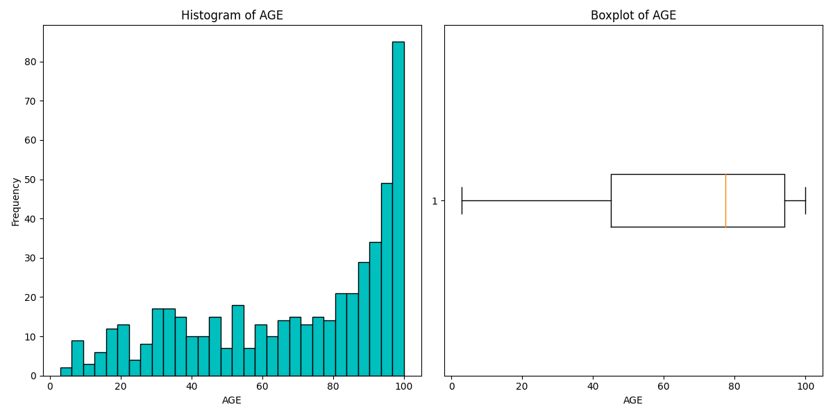
Histogram and Box and Whisker Plot using the Boston Housing Dataset
Today's study is finished.
Next time, I'm going to study dealing with qualitative data.
Rを触ってみる話①
なんか毎回英語だと更新頻度落ちそうなので定期的に日本語投稿も混ぜていく。
Pythonと出会って早9ヶ月。
ついに他言語も学ぶことを決めた。
最近自分の好奇心を抑えられずに、プログラミングに限らずありとあらゆるものに手を出している。
")
これは最近読み始めた本。
その第1章?最初の方で、あらゆるものは複雑系に塗れていて、全てを理解することは無理だよ。やろうとするとフラクタル的に沼にハマるよーって書いてあった。
というわけでフラクタルというかカオスというかそんな状況の私。
仕事でこれやっちゃうといけない気がするけどまぁ趣味なら良いでしょう。
RとRStudio
まずは
Rのダウンロードと
RStudioのインストール
とりあえず基本的な演算子とか関数とかを眺める
':'演算子
2つの整数の間に含まれる全ての整数をベクトルで返す
> 100:150
[1] 100 101 102 103 104 105 106 107 108 109 110 111 112 113 114 115 116 117 118 119 120 121 122 123 124 125 126 127 128
[30] 129 130 131 132 133 134 135 136 137 138 139 140 141 142 143 144 145 146 147 148 149 150
こんなんpythonないよな?多分、、、
オブジェクトの作り方
'<-'という演算子でオブジェクトにデータを格納できる。矢印←って意味なんかな?
> dice<-1:6
> dice
[1] 1 2 3 4 5 6
で、ちょい便利だと思ったのはRStudioにenvironmentってのが表示されてて、そこに作ったオブジェクトが一覧になってること。
ls()関数でも確認できる
長さの異なるベクトルを計算させると短い方がループする
というかそもそも行列の計算じゃなくて要素ごとに計算してる感じ?すごいとっつきにくい、、、
> dice * 1:2
[1] 1 4 3 8 5 12
そしてループが中途半端に終わる(割り切れない)となんか怒られた。
> dice * 1:4
[1] 1 4 9 16 5 12
Warning message:
In dice * 1:4 :
longer object length is not a multiple of shorter object length
と思ったらちゃんと直積を計算する方法があった。
%o%演算子で計算できた。
> dice %o% 1:2
[,1] [,2]
[1,] 1 2
[2,] 2 4
[3,] 3 6
[4,] 4 8
[5,] 5 10
[6,] 6 12
関数
まずは普通の関数
sample(x, y)関数
xベクトルからy個数分の要素を返す。
> sample(dice, 2)
[1] 1 5
replace=TRUEとすれば(Trueだとダメぽい、、)値を取り出すたびに元に戻すようになる。
独自関数の作り方
function関数を使用
{}の中にコードを書く。
> my_function <- function(){
+ dice <- 1:6
+ select_dice <- sample(dice, 2, replace = TRUE)
+ sum(select_dice)
+ }
> my_function()
[1] 9
感想
pythonと劇的な違いはなさそう。なんか頑張ればできそうな気がする。まぁそもそもまずはpythonマスターしろよって話なんですが。
統計検定2級の勉強をする話①
I have participated in Kaggle competitions twice.
Then, I thought that my statistical skills were not enough to do EDA.
So, I decided to study statistics.
My goal is to obtain a second-level license in statistics.
Classification of Variables
Qualitative variable
<Nominal scale>
A nominal scale is a binary variable or a multivalued variable, for example, gender, color, or favorite food.
You can only use frequency.
<Ordinal scale>
Ordinal scales have a size relationship. For example, interview evaluation (A: very good, B: good, C: so-so, D: not good, E: bad)
You can use median and quartile in addition to what is used for the nominal scale.
Quantitative variable
<Interval scale>
Interval scales have meaningful differences between values (e.g., temperature, deviation).
You can use mean and standard deviation.
<Ratio scale>
Ratio scales include age, height, body weight, etc.
The coefficient of variation is only used with ratio scales.
Histogram
If you have quantitative data, you should initially know the frequency of the data to divide the data into some classes.
Histograms are useful for visualizing frequency.
When creating a histogram, it is important to show the features of the distribution without reducing information.
You should make the ratio of the area in any histogram equal to the relative frequency.
A histogram often has one peak. If it has more than two peaks, it is possible to merge multiple distributions.
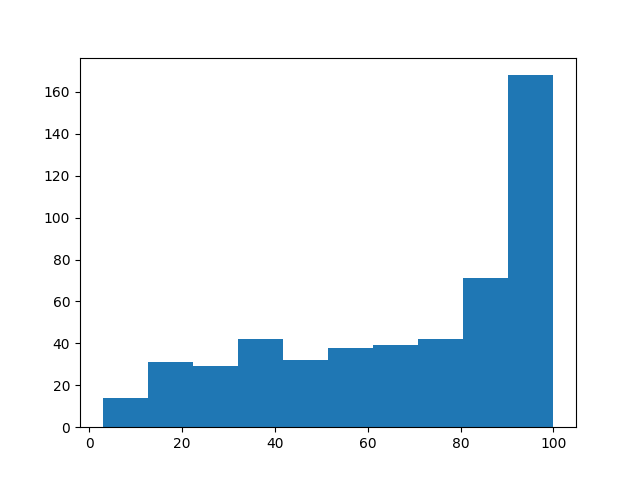
Age histogram using the Boston housing dataset. It has one peak at 90-100 years old.
Cumulative Distribution
The cumulative distribution shows the ratio of the number of observations less than or equal to a particular value.
The graph of the cumulative distribution always increases from zero to one.
The movement indicates the data distribution.
age_sorted = age.sort_values()
p = 1. * np.arange(len(age)) / (len(age) - 1)

plt.plot(age_sorted, p)
plt.show()
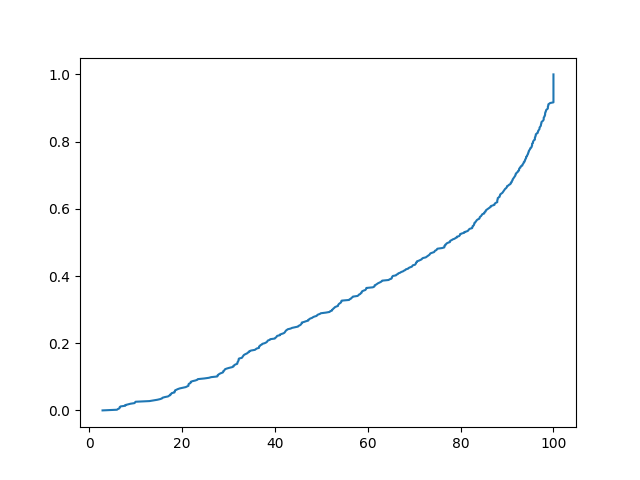 The graph of the cumulative distribution using the same data.
Lorenz Curve
The Lorenz curve shows the equality of incomes.
The x-axis is the cumulative relative frequency of people, and the y-axis is the cumulative relative frequency of incomes.
If all people receive equal incomes, the Lorenz curve is a straight line (complete equality line).
As incomes become more unequal, the Lorenz curve becomes convex downward.
np.random.seed(42)
incomes = np.random.normal(50000, 20000, 1000) #平均5万、標準偏差2万の正規分布から1000個のデータを取得
incomes = np.sort(incomes)

cumulative_income = np.cumsum(incomes)
cumulative_percentile = np.linspace(0, 1, len(incomes))

plt.figure(figsize=(8, 8))
plt.plot(cumulative_percentile, cumulative_income / cumulative_income[-1], label='Lorenz Curve')
#cumulative_income[-1]は累積話配列の最後、つまり合計
plt.plot(cumulative_percentile, cumulative_percentile, label='Line of Equality', linestyle='--')
plt.title('Lorenz Curve')
plt.legend()
plt.show()
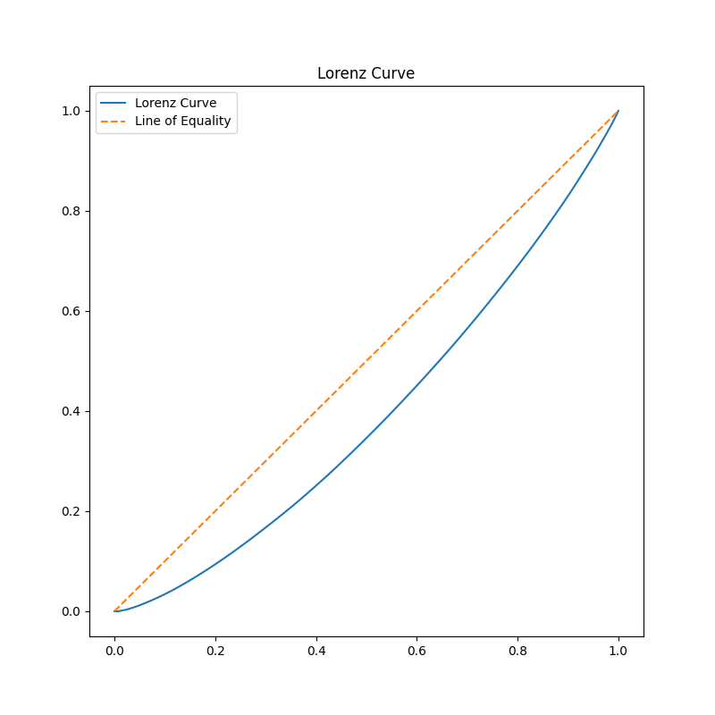
Lorenz curve of incomes.
*Gini's coefficient
Two times the area between the complete equality line and the Lorenz curve.
The closer Gini's coefficient is to 0, the more equal it is.
Today's study is finished.
For improving my statistics skills, I may have to learn the R language.
退屈なことはPythonにやらせよう 第2版 読んでみた⑩

previous article↓
Recently, I've realized that I should be using English in various situations, such as programming, working, or participating in Kaggle competitions.
Starting with this article, I'll attempt to write this blog in English (as long as I don't find it too tedious!).
After drafting, I'll revise the article using ChatGPT.
In doing so, I can reap the dual benefits of automation and improving my English.
Today, I delved into 'Automate the Boring Stuff with Python'.
The topic of discussion is file management.
shutil module:
The shutil module provides functions to copy, move, rename, and delete files.
- shutil.copy(src, dst): This function copies a file (src) to a directory (dst).
- If you wish to copy all files or directories within a specified directory, you should utilize 'shutil.copytree()'.
- shutil.move(src, dst): This function moves a file (src) to a directory (dst).
- While 'shutil.rmtree' can be used to delete all files in a chosen directory, it's a risky approach. It's safer to use the 'send2trash' module.
zipfile module:
Using zip files (.zip), you can compress multiple files to reduce their overall size.
- zipfile.ZipFile(): This is used for reading zip files.
- The 'extractall()' method allows you to decompress a zip file.
- If you aim to create a zip file, pass 'w' as the second argument to 'zipfile.ZipFile()'.
- The 'write()' method lets you add files to the zip archive.
This session has concluded.
The next session will be on 'debugging'.
退屈なことはPythonにやらせよう 第2版 読んでみた⑨
前回
最近読むの飽きてはや1−2ヶ月くらい。
9章なのにまだ半分も読めてない。分厚すぎんだよこの本。
今回は「ファイルの読み書き」
pathlib
ググってコードを書いている身からするとパスの管理はos.pathで行っていたのだが、どうやらPython3.6からPathlibに標準ライブラリとして導入されているらしい。
from pathlib import Path
import os
Path.cwd() #カレントディレクトリの取得
os.chdir() #カレントディレクトリの変更
Path.home() #ホームディレクトリの取得
os.makedirs() #新規ディレクトリの作成
Path.cwd().is_absolute() #取得したパスが絶対パスかどうか
コマンドラインでいうところの
Path.cwd()=pwd
os.chdir()=cd
os.makedirs()=mkdir
的な感じなのだろうか。
パス操作
g.glob()は特定の条件のパスを取得できる。
ただし返すのはジェネレーターオブジェクトなので、中身を表示するにはlist()に渡さないといけない。
p = Path('ファイル名')
list(p.glob('*')) #ファイル内のディレクトリ、ファイルの一覧のリストを取得
list(p.glob('*.txt')) #ファイル内のtxtファイルの一覧のリストを取得
ファイル操作
path関数で行う方法
p = Path("テキストファイル名.txt")
p.write_text("Hello, World!")
ただ、複雑な操作はできないので、基本的にはopen関数を使う
spam = open("spam.txt", 'w') #'w'で書き込みモード
spam.write("Hello, world!")
spam.close()
spam = open("spam.txt") #デフォルトは読み込みモード
spam_r = spam.read()
print(spam_r)
#Hello, world!
これで、テキストファイルを読み込んだり、書き込んだりできた。
さらにpythonデータをファイルに保存する場合はshelveモジュールを使えば変数ごと保存することができる。
次回は「ファイル管理」
第1回Kaggle反省会
前回
はじめに
そんなこんなでとりあえずものは試しでKaggleのコンペティションに参加してみようと思った。
なんとなーく簡単そうなやつをチョイス。
選んだのがForecasting Mini-Course Salesというやつ。
ディスカッションを見てパクれば大体いい感じのスコアにはなるみたいだが、別に休日に趣味でぽちぽちしている身としては順位は割とどうでもいいので、まずはディスカッションは見ずにやってみることにした。
タスク:各日付-国-店舗-品目の組み合わせに対応する品目の売上を予測するモデルを作成すること。
評価方法:SMAPE(対象平均絶対パーセント誤差)
やってみたこと
-
説明変数が質的データだったので、one-hot encordingを行った。
-
季節の要素があるかもしれないと思ったので、日付データは月を説明変数とした。
-
モデルはXGBoostを使ってクロスバリデーションでパラメータを設定した。
-
one-hot encordingよりLabel encordingの方が有用っぽかったので変更した
-
Ridgeモデルとアンサンブルしてみた(適当に重み付けした)
-
アンサンブルにDNNを混ぜてみた
-
アンサンブルにはスタッキングを使用した。
-
Random Forestも混ぜてみた。
-
アンサンブルはバリデーションのSMAPEの逆数に基づいて加重平均をとってみた。
結果…
Public score: 47
Private score: 49
668th/1172(57%)
案の定惨敗である。が、正直1000位くらいだと思ってたので意外と真ん中より下くらいなんだぁと思った。
ここまでは割とどうでもよくで、反省会として1位の人がどういう感じでやったのかを見てみた。
…英語がよくわからなくて詰んだ。
ざっくりこんな感じか?(信憑性なし)
1位の解法:Less is more
前処理
-
各国の祝日を特徴量として使用
-
祝日なのに売り上げが上昇しない場合は採用しない
-
新年とクリスマスは外れ値となる可能性があるため除外し、別にモデル化する
-
(さらにエストニアは12/26、カナダは12/26-27も祝日のため、この外れ値に該当すると判断)
-
日本はクリスマスでも働くやばい国なので、クリスマスも通常日としてカウントする。
-
日付データはそれぞれ、年、月、週、日に分解
-
各国のGDPを考慮
-
祝日はガウス分布に従うとしてなんか色々(よくわからん。
-
クロスバリデーションで特徴量選択(2020年はバリデーションには使用せず)
-
→正弦波で周期性を示すと、それのみでモデル化できた。
モデル
Ridge回帰(Less Is More!!)
学んだこと
- EDAが大事
- 特徴量は都合の良いようにいじった方がいい。
- モデルの選択とか考える前にまずは特徴量の作成&不要な特徴量の削除
- Less is More
- 英語ができないと困る
感想
英語含め意味わからないことが多いが意外と初心者でも面白い。
他の勉強する時間やが消滅するので、中毒性が高くて危険。
またやりたい。やる。
Kaggleに手を出してみたいような出してみたくないような話。
約半年前くらい?プログラマーで、ちょいちょい勉強のアドバイスをいただいている友人に直接会う機会があった。
その友人は以前これ↓を勧めてきて、それを(一応)読んだことはこのブログで書いた。
次は何をしたらいいか?という質問をしてみたところ、
「んーKaggleやってみたら」
とのことであった。ど素人の自分でもSNSとかみてると勝手に目に入るKaggle。
当時の印象は(というか今でも)、
「ガチ勢の方がなんかすごい時間かけてなんかすごいことをやってる(英語)」
というわけで「やってみたら」というにはハードルが高すぎて、「もうちょっと勉強したら、、、」という言葉を言い訳にはや半年が過ぎた。
Label encording
カテゴリ変数を数値化する方法。
import pandas as pd
from sklearn.preprocessing import LabelEncoder
for c in ["Sex", "Embarked"]:
    le = LabelEncoder()
    train_x[c]=le.fit_transform(train_x[c].fillna('NA'))
#LabelEncoderはNaNを扱えないので変換する必要がある。
fit_transformで数値化可能。
クロスバリデーション
データをk個に分割し、そのうち一つを検証用データとして使う。
これをk通りの組み合わせで繰り返す。
from sklearn.metrics import log_loss, accuracy_score
from sklearn.model_selection import KFold
from xgboost import XGBClassifier
import numpy as np
#クロスバリデーション
"""学習データを4つに分割し、うち一つをValidationとして使う。これを4通りの組み合わせで行う。"""
#各Foldのスコアリスト
scores_accuracy = []
scores_logloss = []

kf = KFold(n_splits=4,shuffle=True, random_state=71)
for tr_idx, va_idx in kf.split(train_x):
    tr_x, va_x = train_x.iloc[tr_idx], train_x.iloc[va_idx]
    tr_y, va_y = train_y.iloc[tr_idx], train_y.iloc[va_idx]
    model = XGBClassifier(n_estimators=20, random_state=71)
    model.fit(tr_x, tr_y)
    va_pred = model.predict_proba(va_x)[:, 1]
    logloss = log_loss(va_y, va_pred)
    accuracy = accuracy_score(va_y, va_pred > 0.5)
    scores_logloss.append(logloss)
    scores_accuracy.append(accuracy)

logloss = np.mean(scores_logloss)
accuracy = np.mean(scores_accuracy)
※accracyとlogloss
Accuracy(正解率):分類後のモデルの正答率。モデルの分類の精度を表す。
logloss(クロスエントロピー誤差):分類前( 確率)がどれだけ近しいか。陽性、陰性への近さを表す。
パラメータチューニング
グリッドサーチ:ハイパーパラメータの全探索を行い、最適化したものを使用
#ハイパーパラメータ
param_space = {
    'max_depth':[3, 5, 7],
    'min_child_weight':[1.0, 2.0, 4.0]
}

param_combinations = itertools.product(param_space['max_depth'], param_space['min_child_weight'])
params = []
scores = []
#各組み合わせでクロスバリデーション
for max_depth, min_child_weight in param_combinations:
    score_folds = []
    kf = KFold(n_splits=4, shuffle=True, random_state=123456)
    for tr_idx, va_idx in kf.split(train_x):
        tr_x, va_x = train_x.iloc[tr_idx], train_x.iloc[va_idx]
        tr_y, va_y = train_y.iloc[tr_idx], train_y.iloc[va_idx]
        model = XGBClassifier(n_estimators=20, random_state=71, max_depth=max_depth, min_child_weight=min_child_weight)
        model.fit(tr_x, tr_y)
        va_pred = model.predict_proba(va_x)[:, 1]
        logloss = log_loss(va_y, va_pred)
        score_folds.append(logloss)
    score_mean = np.mean(score_folds)
    params.append((max_depth, min_child_weight))
    scores.append(score_mean)

#最適化したパラメータを使用
best_idx = np.argsort(scores)[0]
best_param = params[best_idx]
アンサンブル
複数モデルを組み合わせて精度を向上させること。
例えばxgboostとロジスティック回帰の予測値を加重平均して新たなスコアにする。
例:xgboostの予測値*0.7+ ロジスティック回帰の予測値*0.3 = アンサンブル後の予測値