統計検定2級の勉強をする話①

I have participated in Kaggle competitions twice.
Then, I thought that my statistical skills were not enough to do EDA.
So, I decided to study statistics.
My goal is to obtain a second-level license in statistics.
Classification of Variables
Qualitative variable
<Nominal scale>
A nominal scale is a binary variable or a multivalued variable, for example, gender, color, or favorite food.
You can only use frequency.
<Ordinal scale>
Ordinal scales have a size relationship. For example, interview evaluation (A: very good, B: good, C: so-so, D: not good, E: bad)
You can use median and quartile in addition to what is used for the nominal scale.
Quantitative variable
<Interval scale>
Interval scales have meaningful differences between values (e.g., temperature, deviation).
You can use mean and standard deviation.
<Ratio scale>
Ratio scales include age, height, body weight, etc.
The coefficient of variation is only used with ratio scales.
Histogram
If you have quantitative data, you should initially know the frequency of the data to divide the data into some classes.
Histograms are useful for visualizing frequency.
When creating a histogram, it is important to show the features of the distribution without reducing information.
You should make the ratio of the area in any histogram equal to the relative frequency.
A histogram often has one peak. If it has more than two peaks, it is possible to merge multiple distributions.
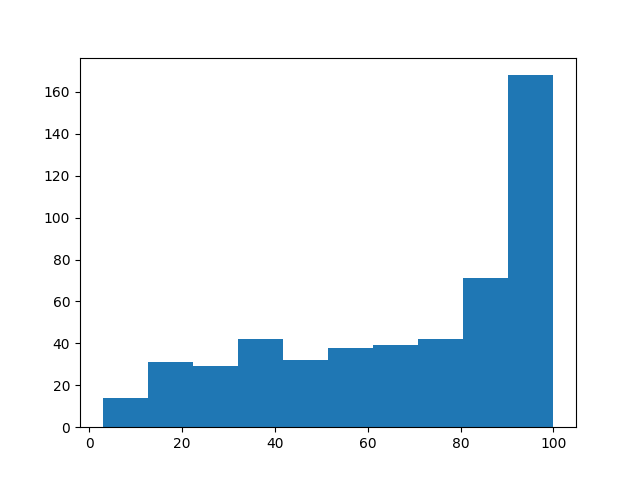
Age histogram using the Boston housing dataset. It has one peak at 90-100 years old.
Cumulative Distribution
The cumulative distribution shows the ratio of the number of observations less than or equal to a particular value.
The graph of the cumulative distribution always increases from zero to one.
The movement indicates the data distribution.
age_sorted = age.sort_values()
p = 1. * np.arange(len(age)) / (len(age) - 1)

plt.plot(age_sorted, p)
plt.show()
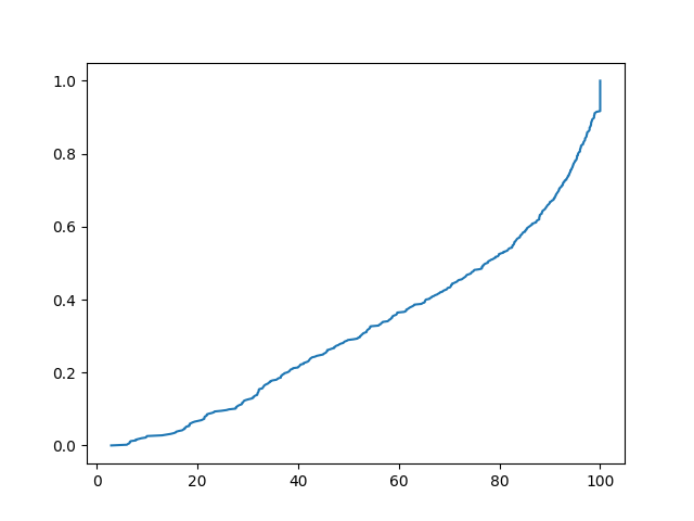 The graph of the cumulative distribution using the same data.
Lorenz Curve
The Lorenz curve shows the equality of incomes.
The x-axis is the cumulative relative frequency of people, and the y-axis is the cumulative relative frequency of incomes.
If all people receive equal incomes, the Lorenz curve is a straight line (complete equality line).
As incomes become more unequal, the Lorenz curve becomes convex downward.
np.random.seed(42)
incomes = np.random.normal(50000, 20000, 1000) #平均5万、標準偏差2万の正規分布から1000個のデータを取得
incomes = np.sort(incomes)

cumulative_income = np.cumsum(incomes)
cumulative_percentile = np.linspace(0, 1, len(incomes))

plt.figure(figsize=(8, 8))
plt.plot(cumulative_percentile, cumulative_income / cumulative_income[-1], label='Lorenz Curve')
#cumulative_income[-1]は累積話配列の最後、つまり合計
plt.plot(cumulative_percentile, cumulative_percentile, label='Line of Equality', linestyle='--')
plt.title('Lorenz Curve')
plt.legend()
plt.show()
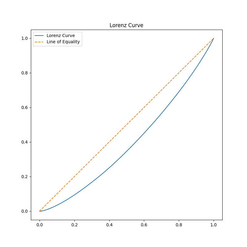
Lorenz curve of incomes.
*Gini's coefficient
Two times the area between the complete equality line and the Lorenz curve.
The closer Gini's coefficient is to 0, the more equal it is.
Today's study is finished.
For improving my statistics skills, I may have to learn the R language.